Best Wayfinding Signs Melbourne Ideas for Offices, Retail Stores & Public Spaces
Finding a place should feel easy, not confusing. That is exactly why Wayfinding Signs matter in modern offices, busy retail stores, hospitals, shopping centres, educational campuses, and public buildings across Melbourne. A well-designed sign does more than point in a direction.
Melbourne design standards are notoriously high, and local businesses can't afford to ignore the customer experience anymore. Whether it’s a high-end corporate fit-out or a chaotic retail floor, Wayfinding Signs are a non-negotiable part of any commercial layout. They keep foot traffic moving smoothly while quietly locking down your branding, safety, and visual appeal in one smart move.
Good signage is often unnoticed when it works perfectly. People simply move where they need to go without stopping to think. That is the real power of effective navigation design. In a workplace, this improves efficiency. In retail stores, it improves customer flow. In public spaces, it creates order and accessibility.
Modern businesses are no longer treating signage as a basic requirement. Instead, it is becoming part of architecture, interior design, and brand communication. This is why demand for directional signage Melbourne solutions has grown across offices, shopping centres, healthcare spaces, educational institutions, and commercial buildings.
How Navigation Design Impacts Daily User Movement
Most people assume navigation is simple until they spend ten minutes looking for a meeting room, a restroom, or a checkout counter in a poorly planned building. That frustration rarely gets blamed on layout alone. In practice, Wayfinding Signs often carry the burden of correcting architectural confusion that should have been solved earlier in planning.
Commercial offices regularly make a common mistake by treating navigation as a compliance requirement instead of a user-flow issue. Reception signs go up, lift directories get added, but movement between zones still feels awkward. Effective Wayfinding Signs work because they anticipate hesitation points rather than react to them after complaints start coming in.
Retail spaces offer another practical lesson. Customers rarely ask for directions if navigation feels intuitive, but staff know exactly how much time gets lost answering repeat location questions. Good signage reduces those interruptions and creates smoother movement patterns, even in busy environments where attention spans are short and distractions are constant.
Practical Signage Mistakes Seen Across Melbourne Fit-Outs
One of the most repeated mistakes in commercial projects is installing signs too late in the process. Interior finishes get finalised, branding gets approved, furniture arrives, and then someone suddenly asks where navigation should go. At that stage, Wayfinding Signs often become reactive rather than strategic.
Another issue is visual overdesign. Businesses sometimes want signs to feel stylish enough to match architecture, but style without clarity creates confusion fast. Designers may favour subtle fonts, low contrast finishes, or decorative placements that photograph well but perform poorly in real use. Wayfinding Signs are not there to impress with a brochure first.
There is also a cost issue that people underestimate. Poor signage usually creates operational inefficiency that never appears as a line item. Staff interruptions increase, visitors get delayed, delivery contractors lose time, and public-facing businesses absorb friction that could have been avoided. Fixing signage later often costs more than planning it properly at the start.
Why Wayfinding Signs Need Functional Placement First
Placement beats aesthetics more often than many people want to admit. A beautiful sign mounted where nobody naturally looks has failed, no matter how expensive the fabrication was. Wayfinding Signs work best when installed based on sightlines, walking behaviour, and decision-making points.
People do not navigate by studying walls like a blueprint; they scan quickly while moving. That means Wayfinding Signs must appear exactly where hesitation happens: corridor splits, lift exits, lobby entries, aisle intersections, or transition points between zones. Designing placement from floor plans rather than real movement patterns and established public wayfinding signage data and standards is where mistakes often happen.
There is also a timing issue. Signs placed too late after a turn are surprisingly common. A visitor walks past the decision point, notices guidance too late, and doubles back. That creates a subtle but real sense of frustration. These are small moments, but repeated enough, they shape the overall experience.
Office Interiors Need More Than Directory Boards
Corporate offices often assume reception directories solve navigation. They do not. A lobby board may explain the building, but internal movement still depends on layered navigation systems that work across multiple touchpoints. Wayfinding Signs in office environments need to support flow, not just provide information.
Big workplaces constantly mess up their departmental zoning. Open-plan layouts look slick and airy, but clients get completely disoriented the second they step away from reception. Tucks of meeting rooms, shared amenities, breakout hubs, and restricted staff zones create constant friction if your internal graphics are inconsistent. Installing proper Wayfinding Signs kills off that awkward hesitation before people have to stop a staff member to ask for directions.
There is also a branding trade-off worth mentioning. Some offices over-minimise signage to preserve a premium interior aesthetic. The result often looks elegant but functions poorly. Staff may adapt over time, but visitors rarely do. Practical navigation should never become a casualty of design restraint.
How to Choose the Right Wayfinding Signs for Any Space
Choosing signage depends on:
Space size
Visitor type
Traffic volume
Branding needs
Accessibility requirements
Indoor or outdoor use
Material durability
Budget
A retail store may need bold retail wayfinding signs, while a corporate office may prefer subtle office wayfinding signage with premium finishes.
Retail Spaces Depend on Faster Decision Navigation
Retail floors are a completely different beast because how people move dictates how they spend. The moment a shopper can’t find a product category, frustration spikes, and they walk out the door. High-quality Wayfinding Signs don't just point people toward the exits; they actively shape customer behaviour and streamline retail efficiency in subtle, commercial ways.
Large-format stores are classic culprits for underestimating category transitions. A customer might grasp the macro store layout but still get totally lost once they’re inside a specific sub-section. Overhead navigation, department markers, aisle numbers, and clear checkout cues have to work as a team. Seamless Wayfinding Signs eliminate that split-second hesitation that breaks a buyer's purchasing momentum.
Retail also faces a clutter challenge. Promotional displays compete with navigation constantly. If signage gets visually buried under campaigns or seasonal displays, direction becomes secondary to noise. This is where restraint matters more than adding extra signs everywhere.
Material Choices Affect Cost and Maintenance Outcomes
Material selection gets framed as a design choice, but experienced installers know it is often a maintenance decision first. Wayfinding Signs made from unsuitable materials may look excellent on day one and age poorly under cleaning, sunlight, traffic wear, or repeated touch.
Acrylic looks brilliant indoors and offers a beautiful, premium finish, but it’s definitely not a one-size-fits-all material. Brushed aluminium is incredibly tough but can look way too industrial in a soft interior. While vinyl decals save you upfront cash, your replacement cycles will become a massive hidden cost if the area gets heavy foot traffic. You need to choose your Wayfinding Signs based on operational reality, not catalogue pictures.
Going cheap on your signage infrastructure is a classic false economy. You save a few bucks on upfront fabrication, only to spend triple that amount replacing peeling vinyl, faded finishes, snapped fixings, or poorly executed work, where a professional window graphics and privacy film installation would have stood the test of time.
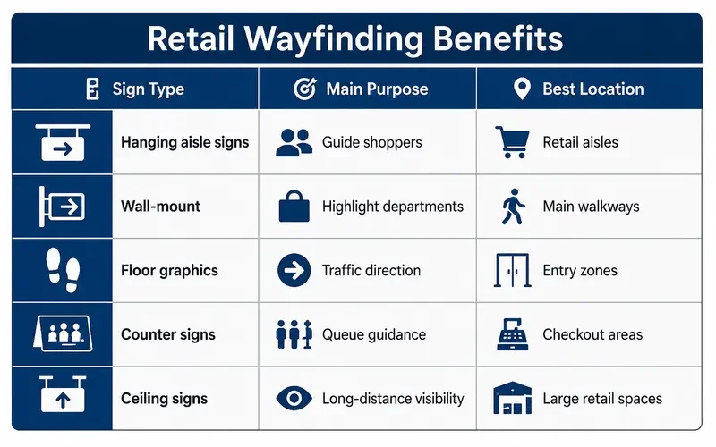
Retail Wayfinding Benefits
Public Buildings Need Clearer Human-Centred Systems
Public spaces introduce complexity that private offices rarely face. Visitor demographics vary, urgency levels differ, and people often enter without familiarity, challenges that also apply to commercial transport environments, where expert vehicle wraps and fleet branding services help establish a clear visual identity.
Hospitals, libraries, civic buildings, transport facilities, and educational campuses often reveal how poorly generic navigation systems perform. A sign that works for regular staff may fail for elderly visitors, non-native readers, or people under stress, which is why specialised commercial signage Melbourne properties require must function across different emotional and practical contexts.
Accessible design also gets oversimplified. Incorporating inclusive wall graphics Melbourne projects depends on means that Braille, tactile lettering, contrast, viewing height, and logical sequencing matter just as much as adding arrows. Accessibility is not solved by a checklist alone; it requires thinking through real use cases with real people in mind.
Branding Must Support Navigation, Not Fight It
Brand-heavy interiors often create a massive tug-of-war between visual identity and practical navigation. Businesses desperately want their graphics to look "on-brand", but artsy branding becomes a major liability the second it dilutes clarity. Your indoor signage Melbourne projects need to champion your brand identity through clear Wayfinding Signs without sacrificing immediate, split-second readability.
Low-contrast colour palettes are a common issue. Stylish greys on darker greys may look sophisticated in presentations, but real-world visibility suffers. Decorative typography creates similar problems. Signage is read quickly, often at a distance, often while moving. Wayfinding Signs need instant recognition more than graphic subtlety.
There is a practical compromise that works better in most projects: let brand elements shape material, tone, and visual language while preserving contrast, legibility, and hierarchy. Striking that balance through custom commercial signage solutions tends to outperform purely aesthetic decisions in everyday use.
Long-Term Signage Planning Saves Operational Headaches
One of the clearest differences between average projects and well-run ones is the planning horizon. Buildings evolve. Tenants change, departments shift, retail layouts adapt, and public spaces update services. Wayfinding Signs should anticipate change rather than lock a business into expensive future revisions.
Modular systems often cost slightly more upfront but save money later. Replaceable inserts, scalable directories, adaptable graphics, and flexible sign families make updates easier, especially when implementing custom business signage Melbourne companies use to future-proof their premises. Businesses that skip this planning sometimes end up replacing whole systems because one department moved floors.
There is no perfect signage formula because every building behaves differently in real use. What works well in one environment may feel excessive in another. Practical signage planning accepts trade-offs, tests assumptions, and treats navigation as part of daily operations rather than a decorative afterthought.
Conclusion
Good navigation often goes unnoticed when it works properly, but poor navigation becomes obvious the moment people start feeling lost or confused. Wayfinding Signs improve movement, reduce delays, support customer experience, and help offices, retail stores, and public spaces function in a smoother and more organised way.
For any local business, a well-mapped set of Wayfinding Signs does way more than just point a finger; it streamlines floor flow, cuts out daily confusion, and keeps operations tight. Smart choices here elevate the entire user experience while boosting your building's efficiency. To get your custom signage sorted, speak with Melbourne’s trusted signage experts today and see how we can transform your space.
Frequently Asked Questions
1. What are Wayfinding Signs used for?
Look at the bigger picture: installing proper Wayfinding Signs is entirely about handing people the autonomy to navigate a complex build without feeling lost. Clear visual markers instantly kill off confusion, tick your mandatory compliance and accessibility boxes, and support basic building safety. It strips the friction right out of the visitor experience across corporate floors, hospitals, and schools, acting as the literal backbone for organised foot traffic.
2. Why are Wayfinding Signs important in offices?
On a chaotic commercial floor, smart placement of your directional assets radically streamlines visitor movement. It stops your reception desk from being constantly bombarded by delivery drivers or lost clients asking where the lift is. Crisp meeting room numbers, clean lift directories, and level markers make navigating a massive floorplate completely effortless while quietly backing up a highly professional corporate identity.
3. What types of Wayfinding Signs work best for retail stores?
Retail environments live or die on the strength of their aisle layout, checkout boards, suspended department graphics, and floor decals. If you don't map out your retail floor correctly, your entire customer flow will bottleneck right at the front doors. High-visibility directional assets ensure shoppers can hunt down specific product categories or service desks instantly without getting frustrated enough to walk out.
4. Are custom Wayfinding Signs better than standard signage?
Let's be completely honest: choosing custom wayfinding signs Melbourne fabrications is always going to be the superior route. They are designed explicitly for your unique architectural footprint, your brand guidelines, and how people actually walk through the space. Off-the-shelf, mass-produced plastic signs look cheap, fail to integrate with your architecture, and completely lack long-term durability.
5. Which materials are best for Wayfinding Signs?
It depends on the environment. We work across acrylic, marine-grade aluminium, stainless steel, vinyl wraps, and backlit LED panels. High-end corporate spaces almost exclusively lean toward architectural acrylic directional signs Melbourne fabrications, whereas high-traffic retail spaces demand more rugged, high-impact materials.
6. Who designs professional Wayfinding Signs in Melbourne?
The best professional signwriters Melbourne has on offer don't just spit out vinyl graphics and drill them into a plaster wall. They map the entire spatial journey from the entry point down, choose heavy-duty substrates that handle local high-traffic conditions, and execute a clean installation. They make sure your visual identity, spatial utility, and building code compliance work together seamlessly for the long haul.